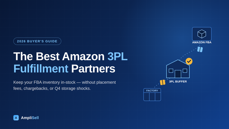
An Amazon storefront template is a pre-built page layout inside the Amazon Brand Store builder. It determines how tiles, product modules, and navigation are arranged on a page. For multi-brand catalogs, choosing the right template pattern per page improves navigation, dwell time, and attributed sales.
This article ranks nine storefront template patterns by how well they serve complex, multi-brand catalogs. Each entry includes AmpliSell first-party usage notes, the modules that power the pattern, and honest pros and cons.
Brand Store
A free, multi-page storefront available to sellers and vendors enrolled in Amazon Brand Registry. It lives at a permanent amazon.com URL and can serve as a Sponsored Brands ad landing page.
Sub-page
A secondary page nested beneath the main storefront home page. Amazon supports up to three levels of navigation, allowing brands to organize content by category, sub-brand, or use case.
Navigation tile
A clickable image or text block on a parent page that links to a sub-page. Navigation tiles act as visual doorways and are the primary tool for directing multi-brand catalog traffic to the right section.
Shoppable image
An image tile that carries up to six interactive product hotspots. Shoppers hover or tap a hotspot to see a mini product card with price, star rating, and an add-to-cart button. Amazon's creative specs recommend a 3,000 x 1,500 px image for full resolution.
Store Insights
The analytics dashboard inside the Brand Store builder. It reports visitors, page views, dwell time, attributed sales, and units within a 14-day attribution window. A late-2025 update added section-level metrics: renders, viewable impressions, clicks, and click-through rate per content section.
Dwell time
The average duration a shopper spends inside the store before navigating away. Longer dwell time historically correlated with higher purchase intent. Amazon's December 2025 quality-rating update shifted the primary quality signal from dwell time to attributed sales.
Attributed sales
Estimated total sales generated by shoppers who visited the Brand Store within the 14-day attribution window. This metric is now the core input for Amazon's High/Medium/Low store quality rating.
Product collection module
A curated grouping of up to 60 related products displayed as a collection tile inside the store. According to Amazon Ads documentation, collections can also appear at the top of search results, extending the store's reach beyond the storefront.
AmpliSell manages full-service Amazon accounts for brands from single-SKU launches to catalogs with hundreds of active ASINs. The nine template patterns below emerged from that work. They are not branded Amazon templates with fixed names; they are recurring structural approaches built using Amazon's native tile types.
Each pattern is evaluated on four axes: catalog shape fit, module requirements, conversion strength, and build complexity.
Stores updated within the past 90 days show 11% more repeat visitors and 13% higher attributed sales per visitor. For multi-brand catalogs, seasonal homepage refreshes alone can lift the store quality rating.
The catalog hub is a homepage built around navigation tiles, each linking to a category or sub-brand sub-page. It acts as a visual directory for complex catalogs rather than a product display in its own right.
The catalog hub pattern uses the homepage primarily as an orientation layer. A brand hero occupies the above-the-fold slot, with branded navigation tiles below it. Each tile represents a product family, sub-brand, or audience segment.
Products appear on the sub-pages, not the homepage itself. This keeps the homepage clean and purposeful.
This pattern suits any brand with four or more distinct product lines that serve different buyer needs. Shoppers arrive, orient themselves quickly, and self-select into the section that matches their intent.
The catalog hub is the most common homepage pattern for multi-brand clients with 40+ ASINs in three or more categories. It reduces scroll depth on the homepage and pushes engagement into the sub-pages where products are actually displayed. In our testing, homepage bounce rates dropped when navigation tiles replaced a long scrolling product grid.
The sub-brand mini-store is a self-contained sub-page nested within the parent storefront. It replicates a standalone brand store, with its own hero, product grid, and story elements.
When a parent brand manages sub-brands with distinct identities, each sub-brand needs a dedicated page with its own visual language. The sub-brand mini-store pattern builds a full page experience under a single sub-page URL. It includes a branded hero, a short brand story section, and a complete product grid.
Amazon supports up to three navigation levels, so a sub-brand page can host its own nested sub-pages for product categories. This is the deepest structural pattern available in the store builder.
For brands that have acquired or incubated secondary lines, the sub-brand mini-store pattern prevents catalog confusion and preserves each brand's equity. We've seen this approach improve attributed sales per visitor on sub-brand pages. Shoppers arrive knowing they're in the right store and trust the curated product selection.
The hero product spotlight page dedicates most of its real estate to one flagship SKU. Large imagery, a video tile, and supporting copy build purchase confidence before revealing the broader product range.
This pattern mirrors the logic of a dedicated product detail page but inside the Brand Store environment. A full-width hero leads the page, followed by a video tile, a benefits-focused image-with-text section, and a grid of complementary products.
The Marquee template in the native store builder is the closest pre-built match for this pattern. Amazon's page templates documentation notes that Marquee includes space for product descriptions, in-use imagery, and testimonials alongside the featured product.
In our testing, hero spotlight pages work especially well as Sponsored Brands video campaign landing pages. The page reinforces the video creative the shopper just watched, creating message continuity that lifts conversion. We've deployed this pattern most often for a brand's top revenue-generating ASIN during peak advertising periods.
This pattern performs best when the Sponsored Brands campaign uses the same hero image as the store page. Amazon's above-the-fold guide recommends matching ad creative to the store landing page to reduce bounce.
The category landing page organizes all products within one category into a structured browsing experience. It combines a category hero with a full product grid and optional filter navigation via product collections.
Category landing pages are the workhorses of most multi-brand stores. They sit one level below the catalog hub homepage and present every SKU within a given product type. The Amazon Ads best-practices guide recommends organizing these pages around how customers actually shop: by product type, use case, or need state.
Product collection modules are particularly valuable here. A single category page can host multiple named collections that auto-populate based on defined criteria. Examples include "Under $25," "Best Sellers," and "New Arrivals."
Across our book of business, category landing pages consistently rank as the highest-traffic sub-pages in Store Insights reports. Category pages should be product-dense and navigation-light. The shopper already made the orientation decision on the homepage, so the category page should move them toward a cart quickly.
The bundle and collection page groups complementary products into a thematic or use-case-driven set. Shoppable images and product collection modules present the full bundle story in one scroll.
Where category pages organize by product type, collection pages organize by intent or occasion. A "Home Office Setup" page or a "Complete Skincare Routine" page groups products a shopper might buy together, across different categories. This pattern is particularly effective at increasing average order value.
Shoppable image tiles are the signature module here. A lifestyle image showing products in use becomes a browsable surface. Each product is tagged with pricing and an add-to-cart option, cutting friction between inspiration and purchase.
In the beauty and wellness space, collection pages built around complete routines or use-case bundles consistently outperform category pages on units-per-order metrics. We've seen shoppable images on collection pages drive higher click-through rates than standard product grids on the same page. Context beats isolation for driving clicks.
The deal and promotions page aggregates active discounts, lightning deals, and limited-time offers in one location. The featured deals tile powers it, giving deal-seeking shoppers a fast path to savings without cluttering catalog pages.
The featured deals tile is the core module for this pattern. It surfaces products with active promotions: Best Deal, Deal of the Day, and Limited Time Deal. Each promotion is removed automatically once it ends.
Amazon's featured deals tile documentation confirms the tile is self-maintaining as long as active promotions exist.
A deal page works best as a persistent sub-page that brands update before major sales events. Linking this page from the homepage navigation tile during Prime Day or Black Friday sends deal-intent shoppers to a curated experience.
Across our book of business, we build a dedicated promotions sub-page before Q4 and Prime-adjacent events. We swap the homepage navigation tile to highlight it during those windows. Brands with a live deal page year-round benefit from automated featured deal tile updates, cutting the overhead of keeping sale content fresh.
The education and brand story page uses text tiles, image-with-text sections, and video to explain how products work. Products appear as a secondary conversion layer below the editorial content.
Not every shopper arrives at an Amazon store ready to buy. For supplements, technical equipment, or skincare with active ingredients, a trust-first page that addresses buyer concerns before showing products produces better conversion. This is the informational counterpart to the hero product spotlight.
The education page leans on the image-with-text tile and video tile to carry its narrative weight. Product tiles or a small product grid appear at the bottom, once the shopper has absorbed the brand rationale.
Maelove grew from $0 to $3.6M in 11 months on Amazon. Educational content played a key role in converting shoppers who arrived through ingredient-focused search terms. An education page that explains formulation philosophy and ingredient sourcing reduces the trust gap that often kills conversion on premium-priced skincare SKUs.
Condition 1, an outdoor and tactical brand in AmpliSell's portfolio, achieved +152% revenue growth in 6 months. An education sub-page covered certifications and use-case scenarios. That gave Sponsored Brands ad traffic a high-trust destination before shoppers reached product pages.
The comparison and decision-aid page uses structured image-with-text tiles and product grids to help shoppers choose between two or more related SKUs. It reduces decision paralysis and lowers cart abandonment.
Multi-brand catalogs often include product variants or parallel lines that differ by strength, size, feature set, or price tier. A comparison page presents those differences in a brand-controlled environment. That beats ceding the comparison to a third-party site or a competitor's ad.
Because the Amazon Store builder doesn't include a native comparison chart tile, this pattern requires creative construction. Practitioners typically use an image-with-text tile containing a designed comparison graphic, followed by individual product tiles for each compared option.
In our testing, comparison pages work best when two or more SKUs share a category and compete for the same search terms. The comparison page answers the question and delivers the product in the same scroll, keeping shoppers from navigating away to research elsewhere. We've seen this pattern improve add-to-cart rates on mid-tier and premium SKU variants.
The content and commerce hybrid page interleaves editorial content with purchasable product tiles throughout. Lifestyle imagery, how-to sections, and brand values copy appear alongside product tiles rather than in separate sections.
This is the most sophisticated template pattern in terms of layout planning. It draws on the editorial playbook of content-forward e-commerce sites and applies it inside the Amazon Store builder.
A shoppable image follows an introductory text tile, a product grid follows a video tile, and so on. The rhythm keeps shoppers scrolling and buying.
The pattern aligns closely with what Amazon's comprehensive Brand Store guide describes as the ideal combination of brand storytelling and product discoverability. It's also the pattern most likely to drive the highest multi-product attributed sales per visit.
In our experience, the content and commerce hybrid suits brands that want the Brand Store as both a marketing and revenue channel. It requires the most planning and the most creative assets. It consistently delivers the strongest Store quality ratings under Amazon's sales-based scoring system. We typically reserve this pattern for established brands with mature creative libraries and clear brand voice guidelines.
Amazon Ads' quality-rating data shows high-quality Brand Stores generate up to 97% more sales than low-quality stores. That figure rises to 39% more than medium-quality stores. The content and commerce hybrid most consistently earns the High rating in AmpliSell's client accounts.
| Template Pattern | Best Catalog Shape | Hero Module | Conversion Strength | Build Complexity |
|---|---|---|---|---|
| 1. Catalog Hub Navigation Page | 3+ product lines or sub-brands | Full-width hero + navigation tiles | Low on homepage, high on sub-pages | Medium |
| 2. Sub-Brand Mini-Store | Multi-sub-brand portfolio | Sub-brand hero + brand story tile | High (within sub-brand traffic) | High |
| 3. Hero Product Spotlight | 1-2 flagship SKUs, high-consideration | Full-width hero + video tile | High for featured SKU | Medium |
| 4. Category Landing Page | 10+ SKUs, category browsing | Category hero + product grid | High (dense product display) | Low-Medium |
| 5. Bundle and Collection Page | Cross-category complementary products | Shoppable image tile | High for AOV (multi-unit) | Medium |
| 6. Deal and Promotions Page | Any catalog with active promotions | Event hero + featured deals tile | High during promotional windows | Low |
| 7. Education and Brand Story Page | High-consideration, ingredient or tech-based | Video tile + image-with-text tiles | Medium (trust-building page) | Medium |
| 8. Comparison and Decision-Aid Page | Versioned or tiered product lines | Comparison graphic tile | Medium-High (reduces abandonment) | Medium |
| 9. Content and Commerce Hybrid | 20+ SKUs, strong visual brand identity | Shoppable images + video interspersed | Highest overall attributed sales | High |
Most multi-brand stores use a combination of these patterns across their page hierarchy. A catalog hub homepage feeds into sub-brand mini-stores or category landing pages. Each of those can include a bundle collection page or deal page as a nested sub-page.
The homepage template pattern sets the navigation logic for the entire store. Getting it wrong means shoppers can't find the right section. Getting it right means each subsequent page can focus on conversion rather than orientation. Store Insights data quickly reveals which outcome has occurred.
AmpliSell's full-service Amazon management team maps the catalog shape first, then selects the template patterns that match it. The template patterns chosen reflect the brand's catalog architecture, not Amazon's default template names.
An Amazon storefront template is a pre-built page layout inside the Amazon Brand Store builder. It determines how content tiles, product modules, and navigation are arranged on a page. Amazon offers three native templates (Marquee, Product Grid, and Highlight) plus a Blank canvas. Practitioners also use recurring structural patterns built on those native templates, such as catalog hub pages, sub-brand mini-stores, and deal pages.
Amazon supports up to three levels of navigation inside a Brand Store. Most brands perform well with four to eight total pages. Pages beyond eight are placed under a "More" tab in the navigation bar, which reduces their visibility significantly.
The Amazon Store builder offers a fixed set of tile types. They include hero image, text, image, image with text, shoppable image, and video tiles. The remaining options include Background video, Gallery, Product, Product grid, Best seller, Recommended products, Featured deals, and Product collection. Each tile type has its own image dimension requirements as defined in the Amazon Ads creative guidelines.
Yes. Brand Stores serve as landing pages for Sponsored Brands campaigns. Ad traffic flows into a curated brand experience rather than a generic search results page. Amazon's own best-practices guide notes that stores updated within the past 90 days show higher attributed sales per visitor. Internal quality-rating data indicates high-quality stores generate up to 97% more sales than low-quality counterparts.
Store Insights is the analytics dashboard inside the Amazon Brand Store builder. It reports on visitors, page views, dwell time, attributed sales, and units sold within a 14-day attribution window. In late 2025, Amazon added section-level insights showing renders, viewable impressions, clicks, and click-through rate for individual content sections on each page.
Yes. A single Brand Store registered to a parent brand can house multiple sub-brand pages using Amazon's three-level navigation structure. Each sub-brand page carries its own hero image and dedicated product collection. A sub-brand page can use a distinct color palette within the overall theme. It then acts as a mini-store inside the parent storefront.
Stores updated within the past 90 days record 11% more repeat visitors and 13% higher attributed sales per visitor. Updates are best scheduled around major sale events, new product launches, and seasonal campaigns. This keeps store quality ratings at the High tier. Amazon now measures that tier by attributed sales rather than dwell time.